I remember sitting on my bedroom floor in 1988, the glow of a heavy CRT television warming my face while I struggled through a particularly punishing maze. Back then, we didn’t have tutorials or glowing waypoints; we had intuition. Today, I see so much “modern” level design that feels like it’s treating players like they’ve never held a controller before, cluttering the screen with digital hand-holding that actually stifles the sense of discovery. We’ve traded the elegant, silent language of environmental storytelling for a constant stream of intrusive icons and map markers that tell you exactly where to go, effectively turning a journey into a mere checklist.
I’m not here to give you a lecture on industry buzzwords or theoretical frameworks that don’t work in practice. Instead, I want to pull back the curtain on how these spaces actually function on a psychological level. We are going to look at how to build environments that respect the player’s intelligence and foster genuine mastery. My goal is to help you move past the clutter and understand the subtle art of guiding a player through intention, rather than instruction.
Table of Contents
The Art of Blocking and Greyboxing Techniques
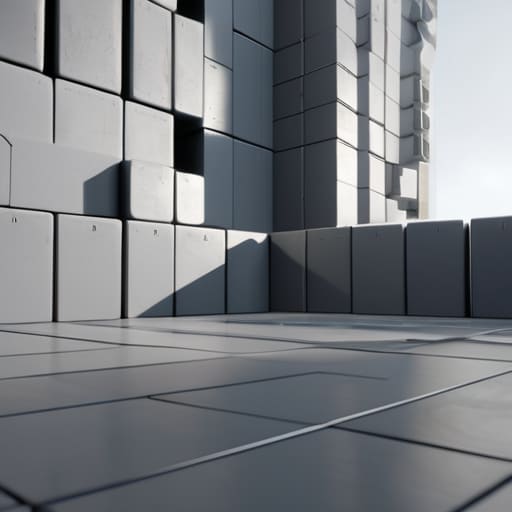
Before you ever worry about the texture of a stone wall or the way light hits a puddle, you have to get the skeleton right. This is where blocking and greyboxing techniques become your best friend. In my experience, trying to polish visuals before the layout is sound is a recipe for burnout. When I’m looking at a prototype, I don’t care if it looks like a collection of grey cubes; I care if the movement feels right. If the distance between two cover points feels tedious or if a jump feels mathematically impossible, no amount of high-fidelity art is going to save the experience.
The true magic happens when you use these primitive shapes to test your combat arena layout and general flow. You’re essentially stress-testing the physics and the scale of the world. I often find that by stripping away the distractions of color and detail, I can more clearly see the spatial composition of a room. Is there enough room for a player to circle an enemy? Does the geometry naturally guide the eye toward the objective? Once the rhythm of the movement feels intuitive in a world of grey, you’ve actually built a foundation worth decorating.
Defining Gameplay Pacing and Rhythm
If greyboxing is the skeletal structure, then pacing is the heartbeat. Too much intensity and your player burns out; too much downtime and they tune out. I’ve spent hours dissecting why certain titles feel like a relentless slog while others feel like a dance. It usually comes down to how effectively the designer manages the tension between action and respite. You have to treat the flow of the experience like a musical composition, where the silence between the notes is just as vital as the crescendo.
To master this, you need to look closely at your combat arena layout and how it transitions into quieter, more reflective spaces. It isn’t just about placing enemies; it’s about managing the psychological weight of the journey. Effective gameplay pacing and rhythm rely on subtle cues that tell the player when to tighten their grip and when to breathe. If you don’t intentionally script these shifts in momentum, the player will eventually stop feeling the stakes entirely, turning a high-tension mission into nothing more than a series of repetitive button presses.
Five Ways to Design Levels That Actually Respect the Player
- Use environmental cues to guide movement. Instead of forcing a player down a hallway with invisible walls, use light, color, or even a subtle change in floor texture to suggest where they should go. It turns a direction into a discovery.
- Master the “tension and release” cycle. If you keep the pressure at a ten for the entire level, the player will eventually burn out and stop caring. You need those quiet, empty corridors to let the adrenaline settle before the next encounter.
- Design with the “failure loop” in mind. When a player dies or gets stuck, the level shouldn’t feel like it’s punishing them for no reason. The layout should provide a clear lesson so they can try again with more intention rather than just frustration.
- Implement verticality to break the monotony. Walking on a flat plane is predictable and, frankly, boring. Adding elevation changes forces the player to constantly re-evaluate their surroundings and expands the tactical possibilities of the space.
- Respect the player’s cognitive load. Don’t clutter a single room with too many competing objectives or complex hazards. Give them one thing to master at a time; once they’ve internalized that mechanic, then you can layer the next challenge on top.
The Designer’s Checklist: Moving Beyond Aesthetics
Master the foundation first; if your game isn’t engaging during the greyboxing phase, no amount of high-fidelity textures or lighting will save the experience.
Treat pacing like a heartbeat, not a constant sprint; you need those quiet, observant moments to allow the player to process their wins before the next challenge hits.
Design with intention by viewing every corridor and sightline as a silent instructor that guides the player’s psychological flow through the system.
The Invisible Hand of the Designer
Good level design isn’t about flashy textures or grand vistas; it’s about the quiet, psychological architecture that guides a player’s intuition without ever needing to hold their hand.
Delia Okonkwo
The Final Layer of the Map
When we strip away the high-fidelity textures and the flashy particle effects, we are left with the bones of the experience. We’ve looked at how greyboxing provides the structural integrity of a space and how pacing ensures that the player’s psychological engagement never flatlines. Level design isn’t just about placing obstacles; it is about orchestrating a flow between challenge and reward. If your layout doesn’t respect the player’s cognitive load or the rhythm of the combat, even the most beautiful graphics won’t save the experience from feeling hollow. Remember, a well-designed level acts as a silent instructor, guiding the player through intentional movement without ever needing to hold their hand.
As you move forward with your own projects or even as you analyze the games you love, I encourage you to look past the surface. Stop seeing levels as mere backdrops and start seeing them as living, breathing systems of cause and effect. Whether you are a developer building a world or a player trying to master one, the real magic happens when you stop reacting to the screen and start understanding the architecture behind it. Gaming is a lifelong study of these complex patterns, and there is a profound, quiet joy in finally cracking the code of a perfectly crafted space. Now, go out there and play with intention.
Frequently Asked Questions
How can I tell if my level is actually teaching a mechanic or if I'm just frustrating the player with poor signposting?
It comes down to the difference between a “eureka” moment and a “why am I here?” moment. If a player stops because they’re curious about a new ledge, you’ve taught them. If they stop because they’re staring blankly at a wall, you’ve failed. Watch for the friction. If the struggle is against the mechanic itself, they’re learning. If the struggle is against your lack of clarity, you aren’t teaching—you’re just being obtuse.
At what point does a well-paced level transition from "engaging flow" into "repetitive monotony"?
It happens the moment the player stops making decisions and starts following a script. Flow relies on a delicate tension between challenge and mastery; you’re constantly reacting to new stimuli. Monotony sets in when the “rhythm” you’ve established becomes a predictable loop where the player’s input no longer requires cognitive engagement. If I can finish a sequence without my brain actually processing the environment, the designer hasn’t built a challenge—they’ve just built a chore.
How do I balance the need for visual polish with the necessity of keeping the core greyboxed geometry functional?
It’s a common trap to let high-fidelity assets distract you from whether a jump actually feels right. My rule of thumb? Keep your “functional” layer and your “aesthetic” layer separate for as long as possible. Use a “beauty pass” only once the greybox movement feels tight. If you start polishing a corridor before you know if players even enjoy walking through it, you’re just decorating a house with a broken foundation.
